FBA inventory map

Where your stock sits versus where your buyers are.

Stock far from your buyers ships slower, and slower delivery can cost you the Buy Box. The map shows your FBA stock and your buyers region by region, and which regions are short or holding extra.
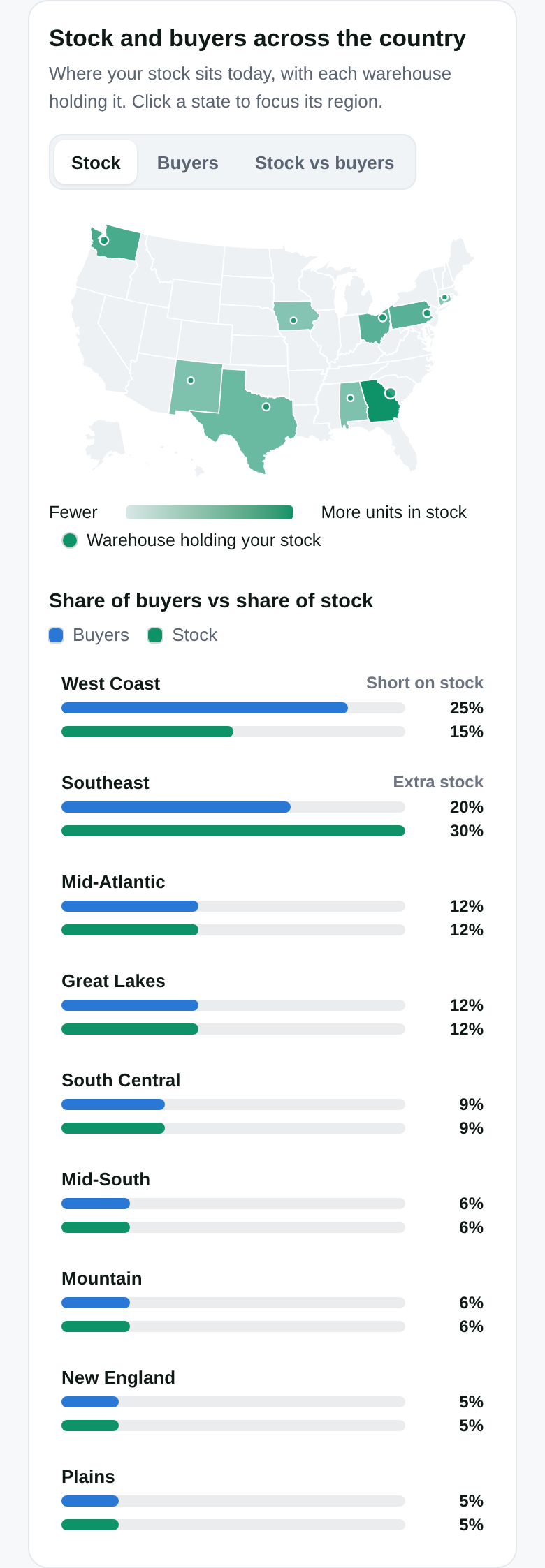
US inventory map with sample stock and buyer shares; the phone view shows the map.
View full product screen ↗View full product screen ↗
01

Stock and buyers, side by side

Each region’s share of your buyers against its share of your stock, with the warehouses holding your stock on the map. Switch between stock, buyers and the gap.

02

Where to add stock, and where it sits idle

Two short lists: regions where many buyers live but little stock sits, and stock sitting far from buyers. Each line says what sold there and in how many days.

03

Days of cover

One rule for stock cover across every tool, using Amazon’s own days-of-supply figure first. The same number holds back ad raises and price cuts when stock is short.

Delivery speed and the Buy Box

Placement is a Buy Box question, not just a shipping one.

The map puts your stock next to your buyers, region by region, alongside the Buy Box places you lost there, so you can see where stock placement may be costing you sales. It reads the same Buy Box checks as the Buy Box map.

  • Region by region: buyers, stock and what shipped from nearby.
  • Shipped from nearby, month by month, to see whether placement is improving.
  • Every product with its stock, cover and placement.

What it never does

  • Moves stock or creates a shipment. Placement decisions and inbound shipments stay with you in Seller Central.
  • Promises delivery speed or Buy Box share.
  • Shows demo data. Everything on the map is your own account’s stock and orders.

Start with one product.

The free audit shows you Estobi on a product you sell. The FBA map is part of a paid plan.

Get your free audit